Join us in advancing global justice through powerful visual stories that bridge awareness to action.
We understand that giving is personal and respect your right to make a gift at a time and at a level meaningful to you. For this reason, we have joined the largest anonymous donation platform in the world—Silent Donor.
Silent Donor allows for generous individuals and companies to send fully anonymous, tax-deductible donations to the organizations they want to support without the additional burden of traditional gift acknowledgments and for continuous solicitations. Click the links below to access their private platform – simply write in Art Works Projects as the organization to receive your donation on their form. Choose to donate anonymously via card, bank transfer, or cryptocurrency. Send your anonymous donation to support critical storytelling that advances global justice.
We need your support more than ever. Make your gift through the Silent Donor.
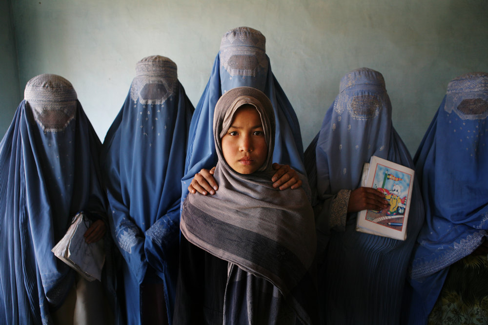
Jean Chung for Women between Peace and War: Afghanistan
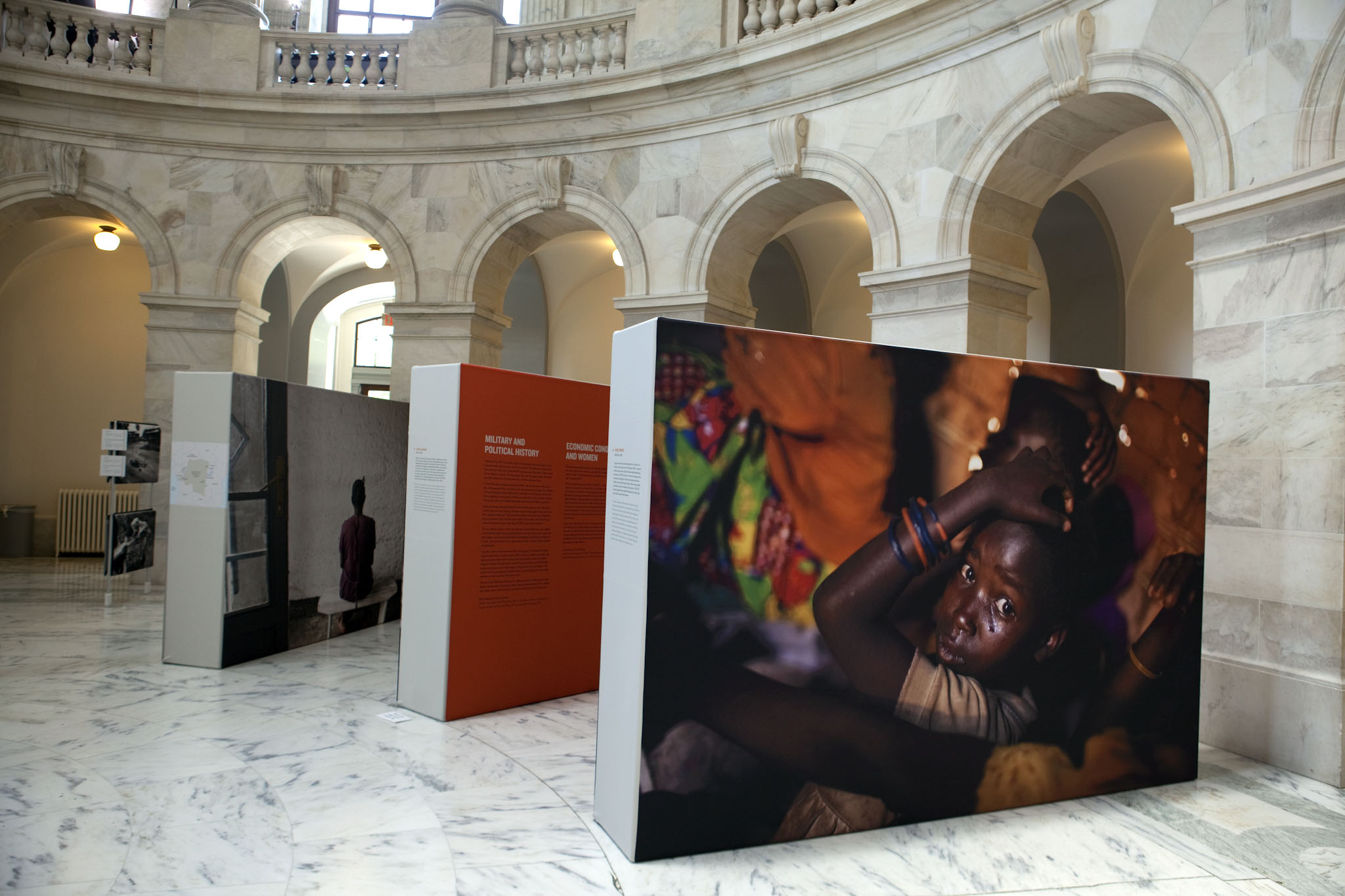
20 Years of Bearing Witness
ART WORKS Projects has leveraged the power of photography and documentary film to raise awareness and educate the public about some of the most pervasive and grave human rights violations.
Since ART WORKS launched 20 years ago, we’ve supported dozens of projects documenting stories around the world.
Since we launched as a human rights arts advocacy organization in Chicago 20 years ago, we have made strides in establishing a significant global footprint. Using art to reach hundreds of thousands of viewers, AWP has inspired audience members on five continents to support an end to grave human rights abuses. While we are proud of our impact, we know more essential works needs to be done.